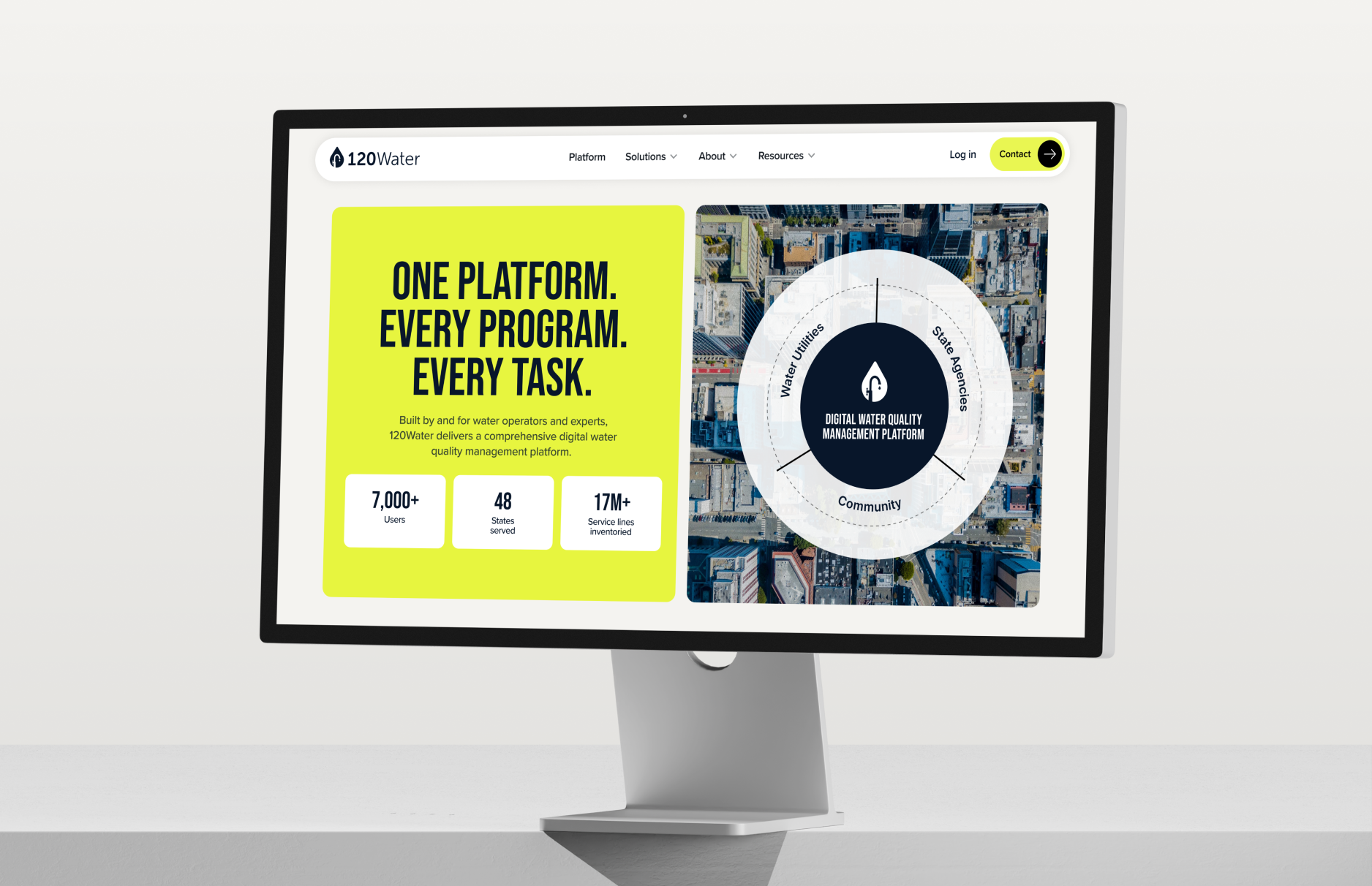
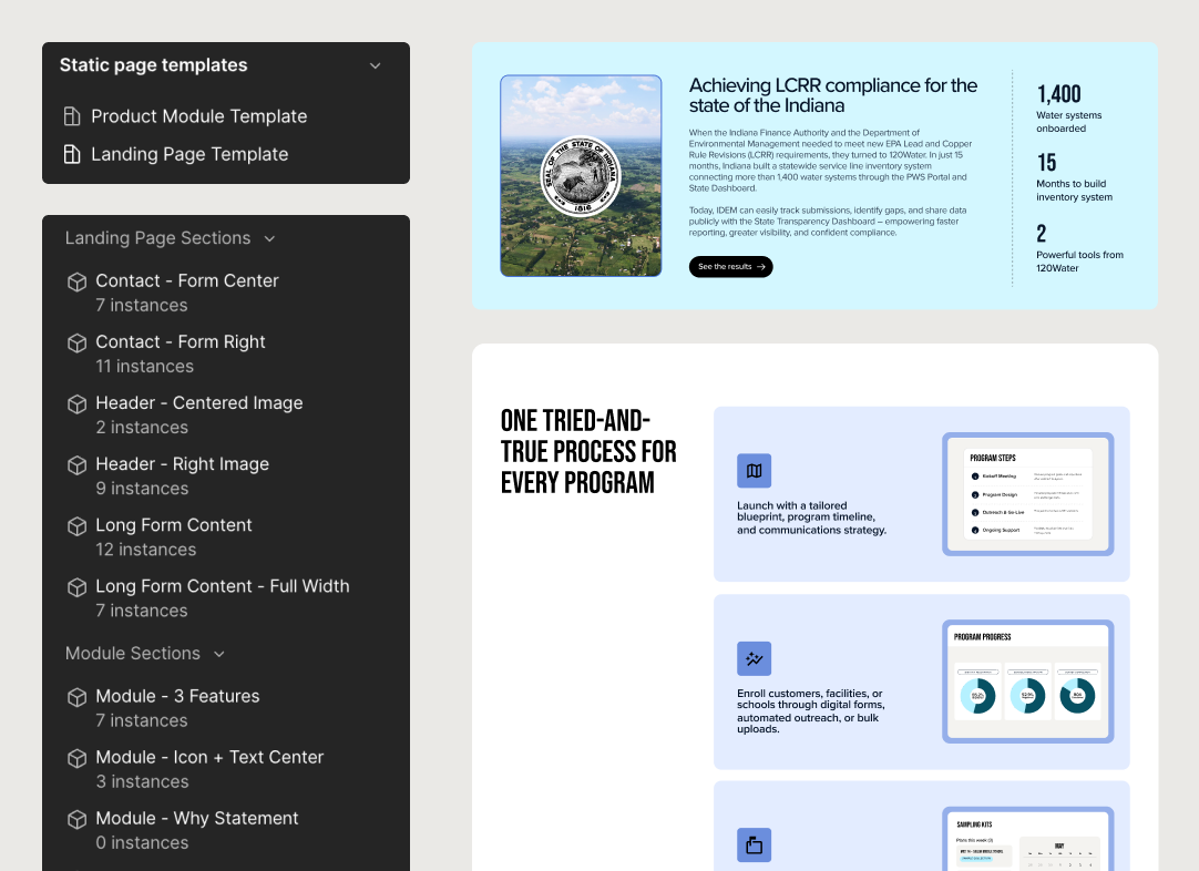
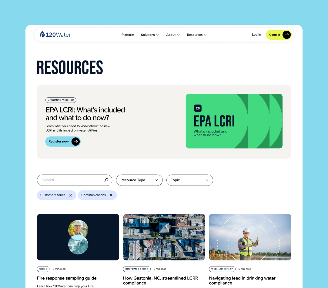
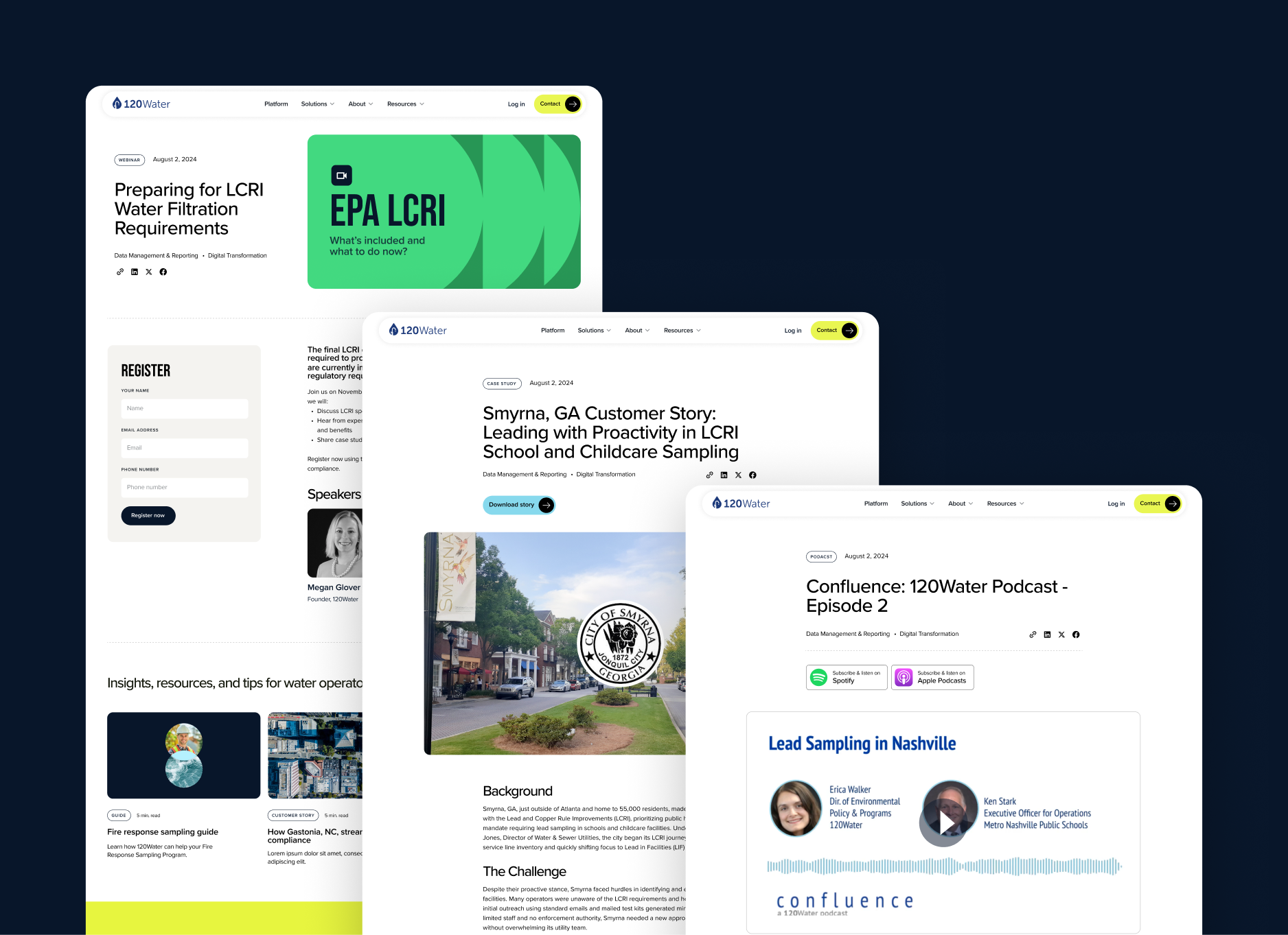
120Water

BRAND  |  WEB
Aerial view of a water treatment facility with large circular sedimentation tanks and connecting blue metal walkways.
120Water

Transforming an established water quality platform into a vibrant industry stand-out

Brand refresh
Website design
Website migration
Development
SEO strategy
View Live Site
Water Technology
Challenge
120Water came to us at a pivotal moment, they had a robust product suite but struggled to communicate it cohesively.

They needed more than a redesign—they needed a complete digital transformation that would reflect their evolved product strategy while preserving years of established SEO authority and content investment.
Approach
Moving from WordPress to Webflow, we created a dynamic new web presence that strategically guides different audiences through tailored journeys, showcases real community impact, and gives the 120Water team complete control to evolve their site as their business grows.
Brand refresh
120Water website homepage showing a dashboard on a laptop, highlighting digital water management tools, with text about making water work for everyone and logos of trusted water systems across the nation.
Brand refresh
Providing structure with color and illustration.
In an industry dominated by blue palettes and generic water stock photography, we pushed 120Water's brand evolution even further by refining vibrant neon accents that complement their established blue.

We focused on authentic visuals—muddy boots and trenches representing the real work, aerial community footage—paired with bold Bebas headlines that command attention and reflect their position as the dynamic, forward-thinking choice in water quality management.
Three circular profile images: a male construction worker in a helmet, a female scientist in a lab coat working, and a smiling man in a beige shirt. Below them, a green rectangular card with text 'EPA LCRI What’s included and what to do now?' and a video camera icon. Two colorful abstract rectangular shapes are underneath.
Creating a visual language for community and connection
Inspired by the ripple effect of water and the interconnected nature of water systems and communities, we developed a distinctive visual language built on circular patterns and concentric animations that literally radiate connection.
Engineer in a safety vest and helmet testing water samples at a wastewater treatment plant with aerial views of water tanks and infrastructure.
Website
Dashboard showing total utility metrics with 22,954 complete line verifications up 2%, 794 single owner service lines unchanged, and utilities by county listing Greene, Clinton, Warren, Carroll, Howe, Martin, and Putnam.Grid showing eight labeled modules with yellow icons: Data Hub with chat icon, Inventory Manager with list icon, Insights with lightning bolt icon, Utility PTD with bar chart icon, 120 Connect with code brackets icon, Sampling Fulfillment with checkmark icon, Sample Manager with flask icon, Communications with envelope icon, Verify & Replace with wrench and screwdriver icon, and Backflow with wavy lines icon.
Collage of 120Water website pages showing water quality management, community empowerment, utility tools, and contact form.
Updated product imagery
Aerial view of a residential neighborhood with houses, curved roads, green lawns, and trees on a sunny day.
Dashboard showing service lines with a submission deadline of 23 days until September 27, 2026, a material classification bar with segments for Non-Lead, Lead, GRR, and Unknown, and a table listing service line details including ID, address, LCRR tier, status as In Service, material types such as Unknown, PVC, Ductile Iron, Lead, and install dates of June 14.Graphic with two white rectangles on a green background, showing a water quality sampling program card with steps to fill, secure, and mail it, and a survey prompt to help protect drinking water.
Using motion to tell 120Water’s brand story
We brought the story of water's cyclical journey and community impact to life through animations that visualize abstract concepts and draw the eye to strategically chosen product features.
Animated wheel diagram with five segments labeled Brand, User, Product, Engaged, and Internal connected to a central circle labeled Alpha.Aerial view of houses with orange tile roofs and a narrow street with parked cars between them.Text reading 'MAKE WATER WORK FOR EVERYONE' with a description about 120Water as a digital water quality management platform, alongside buttons labeled 'Explore the platform' and 'Ask a question'.
Computer monitor displaying 120Water website with a digital water quality management platform overview and user statistics.
Robust Webflow Component Library & Seamless Migration
We built an extensive library of flexible components and page templates in Webflow, giving the 120Water team the tools to confidently create and edit pages without technical dependencies.

This included migrating their entire content library with a strategic redirect and sitemap plan to preserve SEO value, plus detailed training documentation and team support to ensure smooth knowledge transfer and long-term success.
Web design interface showing a sidebar menu with static page templates and landing page sections, alongside content panels describing LCRR compliance in Indiana and a process flow for program steps and progress.120Water Resources webpage featuring an upcoming webinar on EPA LCRI with registration button, search filters, and articles on fire response guide, LCRR compliance, and drinking water compliance.
Screenshots of 120Water web pages featuring an EPA LCRI webinar registration, a Smyrna, GA customer story, and a Confluence podcast episode with lead sampling experts.
Explore more of our work
Black six-pointed asterisk symbol on white background.

A powerhouse two-woman midwest agency, building meaningful brands and websites that deliver results.

© Emerald. All Rights Reserved.